Spotlight: A Gilt Bronze Figure of Louis XIV and Self-Fashioning Long Before the Age of Selfies

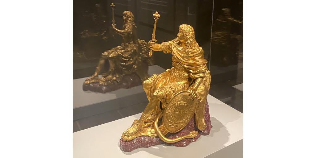
Image credit: Attributed to Domenico Cucci and his workshop, Figure of Louis XIV, 1662-64. Manufactured by the Gobelins Workshop in Paris. Gilt bronze and porphyry, 18 1/2” (h) x 10 1/2” (l) x 15 1/4” (w). The Frick Collection, New York. March 2023 installation shot of the Gregory Gift exhibition at The Frick Madison. Courtesy of the Frick Collection.

As The Frick Collection curator Marie-Laure Buku Pongo explained recently in the most accessible way, “Louis XIV (1638 -1715) would have been right at home in today’s selfie era.”

Ample evidence for this claim abounds (in fact, all of Versailles was decorated and configured symbolically to amplify the so-called Sun King’s position at the center of court and indeed the universe) but Pongo was directing our gaze in particular to this 18 1/2” x 10” gilt bronze figure that entered the collection as part of the extensive Gregory Gift (on exhibit now) and offers a stellar example (no pun intended) of the kind of exquisite craftsmanship and self-aggrandizing political propaganda the French king appreciated and deployed throughout his reign. It depicts the idealized monarch wearing splendid armor, a draped cloak, and a lion’s pelt (a well-known reference to Hercules), holding a regal scepter in his right hand. Intended to celebrate the king’s glorious, hard-won victory over the Spanish, the sculpture was manufactured at the Gobelins workshop in Paris as one of a pair of gilt bronze statues crowning a giant cabinet produced specially for the ruler; the other statuette may have shown him riding a chariot. That’s a lot of intricate, extravagant detail and symbolic freight for two pieces you had to look up high to actually see, and a whole lot of Louis as well!

Definitely a different time and place! Needless to say, Versailles during the 2nd half of the 17th century was absolutely Louis XIV’s world and everyone else was just living in it.

Spotlight: Hear Me Now: Voices of African American Potters Past and Present

Installation shot: Hear Me Now: The Black Potters of Edgefield exhibition at the Metropolitan Museum of Art in New York. Object: David Drake (Dave the Potter), Twenty-Five Gallon Four-Handled Stoneware Jar, 1858. Stoneware with alkaline glaze, 24 1/2 × 24 1/4 × 24 1/4 in. Collection: Crystal Bridges Museum of American Art, Bentonville, Arkansas.

Soon to close is a powerful and poignant exhibition at the Metropolitan Museum of Art. Hear me Now: The Black Potters of Edgefield South Carolina presents approximately 50 ceramic objects made by African American potters during the 19th century, alongside contemporary artistic responses by Simon Leigh, Robert Pruitt and others.  The stoneware vessels – made in the Old Edgefield District of South Carolina, an important center of this industry in the decades before and around the Civil War – were products of involuntary labor, manufactured by enslaved African-American peoples, situating their genesis within the complex and problematic history of the South. These pots are also extraordinary works of art, and serve as important records of material culture, stirring testaments to lived experience, technical knowledge, artistic agency, and the spirit of individual makers, some known, others whose names are now lost to us.  Well represented are the pots of Edgefield’s best-known artist, a potter and poet named Dave. During his lifetime, Dave the Potter (who eventually took the surname Drake) was recognized and highly sought after for the excellent quality and craftsmanship of his monumental, akaline-glazed pots. He likely made thousands of jugs, storage jars and other other stoneware vessels. Many of these were inscribed with the potter’s name and short verses bearing witness to his traumas, joys, relationships and daily experiences. These inscriptions – ranging from biblical and mundane to witty and elusive – represent a defiant and confident expression of selfhood at a time in the US when writing was considered a punishable offense for someone of enslaved status.

Spotlight: Conversing in Clay (What do Ceramics Have to Say these Days?)

Installation photo of objects in LACMA’s exhibition Conversing in Clay: In the foreground: Bowl with circular pattern, (Korean, unknown maker, 15th century), and Bottle with chrysanthemum scroll design, (Korean, unknown maker, 12th century), and behind them and to the left: Yeesookyung’s Translated Vase (2013).

Conversing in Clay, a small and delightful installation at the Los Angeles County Museum of Art (LACMA) through mid-May highlights a handful of ceramics (14 in total) and demonstrates superbly how the juxtaposition of historical and contemporary objects can tell us so much – about symbolic meaning, technical achievements, and resonances throughout time.

As the museum asserts, “One of the earliest and best-preserved areas of artistic production across the globe, ceramics remain a vital field of expression and experimentation into the present.” This is an argument which LACMA is well-positioned to make on account of their wide-ranging collection, which spans from antiquity to the present and includes several recent acquisitions. Exploring works recent work by artists Nicholas Galanin, Steven Young Lee, Courtney Leonard, Robert Lugo, Elyese Pigonlet, and Mineo Mizuno (whom Boulevard Spotlighted a few months ago) alongside centuries-old, historical objects allows visitors to piece together (sorry for the pun) how artists working today engage with, reference, and reinvent international artistic traditions rooted far back in the past. Humor, activism, process, imagination, and inspiration are a few of the words that come to mind when looking through the varied contemporary lenses of these artists.

One of the most compelling objects is Translated Vase (2013) by Yeesookyung (South Korea, b. 1963), a tantalizing and strangely biomorphic sphere with a bumpy surface consisting of a patchwork of delicately patterned celadon - facets and bulges articulated by an irregular network of warm gold veining. Providing historical context (and lovely in their own right), a nearby vitrine holds two much older Korean objects: an earthenware Bottle with chrysanthemum scroll design (unknown maker, 12th century) and a 15th-century Bowl with circular pattern (also artist unknown). Yeesookyung’s artistic project involves creating new vessels from ceramic fragments sourced from contemporary vases made in traditional Korean workshops that have been deemed inferior and thus discarded. Recouping these porcelain shards and “translating” them into novel forms is a way of connecting to the centuries-long history of ceramic production in Asia, which originated in China. It also offers an opportunity for the artist to evoke the overlapping and contentious histories of the countries that make up East Asia. Her practice of binding fragments with a gilded epoxy is an explicit reference to the Japanese technique (and philosophy) of kintsugi – in which broken pottery is repaired with gold lacquer. This ancient technique is underscored by the belief that an object should display its history and that imperfections should be understood as precious and beautiful. The concept of fragility as an inherent part of the human condition itself (and that sense this could viewed as a badge of courage, a mark of sadness, or even in an amusing light) is seemingly intertwined in the way Yeesookyung’s pieces appear to have an almost animal or human sentience to them. Apparently, also, the Korean words for crack and for gold are similar, so covering the cracks in gold adds an aspect of humor to the Translated Vase.

Needless to say, the many intriguing “conversations in clay” between each of the artists, their materials, and tradition –as well as in visual dialogue with the other objects on display in the show – are definitely ones you will want to “listen” to and reflect upon.

Spotlight: Glenn Kaino's "A Forest for the Trees": When The Natural World Meets Tech

Fall 2022 installation photos of “A Forest for The Trees,” an immersive, interactive experience in Los Angeles created and directed by Glenn Kaino

Concern for the earth and cutting-edge technology aren’t always seen as compatible concepts, but Glenn Kaino’s A Forest for the Trees,” a 35-minute multi-media experience brings the two together in a unique conjunction. The project is intended to raise awareness and urgency by amplifying tribal stories, ancestral knowledge of indigenous peoples, and ecological issues through immersive and interactive encounters. Produced by SuperBlue (a showcase for experiential art) and born from an extensive collaboration with Atlantic journalists, tribal leaders, environmental scientists, and artists, A Forest for the Trees weaves together a multiplicity of voices and modes. It also occupies a fascinating and (at times slightly uneasy) position as an amalgam of contemporary art, (for-profit) cultural entertainment, eco-science, and environmental activism, which asks visitors to reimagine their relationship with the natural world and with Native American traditions and culture. .

Sprawling across a 28,000 square foot warehouse in Los Angeles, the exhibit (a term typical for immersive experiences these days) evokes a surreal forest broken into several experiential spaces - essentially stations, some more engaging or aesthetically appealing than others. A Forest begins by listening as a group to a tribal story about ecosystem renewal, while encircled in a small dark space with projected woodcut illustrations (before the imagery switches to a more science-driven bent ); next an activity involving a spinning optical illusion, and led by a guide, gets visitors to consider the vast interconnectedness of the world. This is followed by walking through a specially-lit thicket of reclaimed California redwood trees, interacting with a giant illusion of fire that reacts to motion, “walking” on water (in the form of stunning glass flooring), and finally hearing from a group of “talking” masks with indigenous voices speaking about nature which activate individually when approached.

The culmination of A Forest for the Trees, and true WOW moment, occurs at the at the end of the exhibit. Here, visitors are encouraged to congregate on benches made from reclaimed trees, facing the final installation, a massive tree sculpture called Resurrection. This sculpture is based on the remains of the famous Olivera Street Fig Tree, a 144-year old tree and LA landmark, which was sadly felled in a 2019 storm. Giving it new form, artist Glenn Kaino constructed a giant armature of steel cubes with glass fronts à la Minecraft, connecting the parts of the dismantled tree. Activated in a timed performance of operatic light and sound, the huge installation is meant to evoke a magical resurrection of the Olivera Fig Tree, which in turn becomes a metaphor for resurrecting our own appreciation of trees and the forests that contain them.

Especially having visited the area in and around Olivera Street earlier that day, I was particularly struck by the chord of local specificity. And in the end, Resurrection was truly more poignant and beautiful than I would have expected.

Spotlight: “All The Vermeers In New York” Will Soon Be A Few Less…

Johannes Vermeer, Mistress and Maid, c. 1666-1667. Oil on canvas, 35 1/2” x 31” (90.2 x 78.7 cm) The Frick Collection, New York. (Frick Madison, 2nd floor, Rm 6)

This fall is your last chance to see the Frick Collection’s Vermeer paintings for a while, unless you are planning a trip to the Netherlands, where the Rijsksmuseum is holding what is being hailed as the largest Vermeer show ever, running from February 10 - June 4, 2023. This will undoubtedly be a once-in-a-lifetime event, bringing together loans from all over the world with groundbreaking recent research from curators, conservators, and scientists, who have dedicated themselves to this topic for several years.

A standout even among the best Golden Age Dutch painters, Johannes Vermeer (1632-1675) is best known for painting remarkable interior scenes, intimate genre scenes capturing absorbed or conversing figures in telling detail and stunning light effects. His exquisite touch and sensitivity, revealed in the highlighting on a pearl in his Girl with a Pearl Earring (1665), the candid expressions of two people relating, or the shadow cast across a black and white-tiled floor remain mesmerizing for viewers centuries later, connecting us with aspects what it means to be human, and allowing us to seemingly share in a moment frozen in time

The artist was not a prolific painter however, with an output of some where around 37 officially attributed paintings, making those ones extant all the more beloved and treasured. The Frick owns three of these: Girl Interrupted at her Music (1659-61), Mistress and her Maid (1665-67), and Officer and Laughing Girl (1657-58) , with this last one having already departed for Europe.

Don’t miss out on seeing the remaining two works, before they leave the Frick Madison. Or better yet, plan a trip to see them, along with Officer and Laughing Girl and many other 17th century “old friends,” which will be given incredible context within the Rijksmuseum exhibition in the spring!

Spotlight: Have You Heard of French Art Dealer Berthe Weill? Have We Got a Book For You!

Book cover: Pow! Right in the Eye! Thirty Years Behind the Scenes of Modern French Painting. 2022, designed by Jill Shimabukuro (inspired by the original French edition, written by Berthe Weill, and published in 1933).

Attended a fantastic conversation the other night between Lynn, Gumpert, Director of the Grey Art Gallery and Veronique Burke, Co-Founder of Women Art Dealers Digital Archives at the Pen + Brush Gallery in the Flatiron. The rich discussion was centered on the inextricable life and work of the the provocative Parisian art dealer Berthe Weill (1865-1951).

Small but mighty, the under 5 ft. tall, bespectacled Berthe, who rose from a background of poverty and had to battle both the anti-semistism and misogyny rampant in her day, was nevertheless a formidable force in the field for over 40 + years. Committed to championing “les jeunes” (the new artists), she suported and helped shape the early careers of Picasso, Modigliani (who didn’t really have a late period since he died at the age of 35) and several women artists, including Suzanne Valadon.

The occasion for the POWarts-sponsored event was this year’s release of the newly-translated version of Weill’s punchy 1933 memoir Pow! Right in the Eye! (edited by Gumpert and masterfully translated by William Rodarmor). As you can imagine the evening’s presentation was lively, full of familiar art and some surprises, and the terrific anecdotes were flying.

What a treat to dig into this topic and to learn more about this scrappy, dedicated and daring figure at the heart of the 20th century art world with two experts. And, even more exciting to discover that the Grey Art gallery in NYC will host an exhibition about Berthe Weill and her stable of artists in 2024 (it was supposed to open in 2022 to coincide with the new publication, but was postponed because of the pandemic). The show will travel to venues in Montreal and Paris as well. In the meantime, everyone should grab Berthe’s memoir, like we did. You’ll be thoroughly entertained and gain a whole new perspective on French modernism and bohemian culture from a woman on the inside!

Spotlight: Meret Oppenheim's Artistic Freedom on Display at the Museum of Modern Art

A melange of objects by Meret Oppenheim, including paintings, assemblages, sculptures, drawings (jewelry, prints, and performance) on display at the Swiss artist’s retrospective in New York at the Museum of Modern Art. November 2022.

Visitors to the Museum of Modern Art in New York will be amazed to see an incredible, imaginative world opened up to them through the just-opened Meret Oppenheim: My Exhibition, which covers six decades of Oppenheim’s career and features hundreds of objects. The Swiss artist (1913-1985) is undoubtedly best known (if at all) for her Surrealist “Object” (often referred to as the “Fur-lined Teacup” for obvious reasons), which was produced in 1936, when Oppenheim was in her early 20s and living a bohemian existence in Paris. This small, sensational work, made of luxurious fur (sorry PETA, it was a different time) applied to an everyday cup, saucer, and spoon, was acquired early on by MoMA. Though many in 1930s America were not aware of the name of the maker, the artist’s “object” caused quite a stir and even came to emblematize the concept of Surrealist assemblages creatively juxtaposing unlikely items and ideas to elicit frisson, and often attraction/repulsion simultaneously. Oppenheim nailed it!

But as MoMA’s expansive show clearly demonstrates, Oppenheim was - and created - so much more than this “infamous” piece alone. The artist continually mined her psyche and reinvented herself, radically transforming images and ideas, collaborating with other younger artists, and experimenting across media (including performance) - with originality, humor, and aplomb until the day she died.

“Nobody will give you freedom,” the artist proclaimed, “you have to take it”. And she did.

Spotlight: AFRICA FASHION at the Victoria & Albert Museum

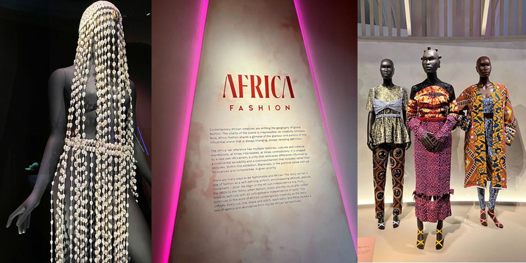
Installation shot of the multi-media AFRICA FASHION exhibition at the Victoria & Albert Museum in London showing various designs and a didactic panel, October, 2022.

Wow!!!! Just finished going through AFRICA FASHION at the Victoria & Albert Museum - an institution which keeps turning out amazing show after amazing show, opening up the narratives visitors experience, and how they experience them (through inventive curation, exhibition design, and digital programming). Some shows are just transformative; you feel changed after leaving the museum or gallery. This is one of those! Spectacular fashion, but so much more…

Succinctly described on the museum’s website as: “Spanning iconic mid-20th century to contemporary creatives through photographs, textiles, music and the visual arts, ‘Africa Fashion’ explores the vitality and global impact of a fashion scene as dynamic and varied as the continent as itself.”

In addition to a panoply of color, pattern, and texture, the garments (photographs and more) deftly installed and enhanced by great exhibit design and didactics, as well as music and video, offer multiple entry points into fashion as a self-defining art form across an ‘Africa’ of multiple histories, cultures, and creative expressions, shared from myriad African perspectives. The expansive experience, a celebration of sorts, is layered, nuanced, polyphonic. Go see it! Or at least visit the V&A’s site to learn more.

Spotlight: Immersed in Park Dae Sung’sWork at LACMA

Installation shot at the Los Angeles County Museum of Park Dae Sung, Snow at Bulguk Temple, 1996. Ink on paper. Collection: Gyeongju Solgeo Art Museum.

Walking around the first-floor galleries at LACMA, we had the pleasure of stumbling upon a riveting installation showcasing Korean history and calligraphy. Park Dae Sung: Virtuous Ink and Contemporary Brush  features eight stunning works, including six massive ink paintings, by the greatest living Korean ink master, Park Dae Sung (b. 1945). Self-taught, Park has spent time in China, walked the Silk Road, and searched for the meaning of hanja (Chinese characters), the aesthetic foundation of his calligraphy and paintings. With a single brush, and working on the ground to prevent the ink from dripping, he masterfully portrays his subjects by fusing the aesthetics of East and West. Putting a contemporary spin on the traditional art of ink-and-wash painting, Park’s works often reimagine the landscapes typically portrayed by Chinese and Korean ink masters.

Our favorite ink painting Snow at Bulguk Temple (1996), the showstopper seen here, which spans an entire wall, depicts a snowy landscape in Gyeongiu, located 170 miles southwest of Seoul.  Constructed in 774, the Bulguk Temple is considered a National Treasure and a UNESCO World heritage site. After studying in New York the previous year, Park returned to Korea, and spent much of 1996 visiting the Bulguk Temple, where he was deeply affected by witnessing snow falling. From careful studies as well as subsequent memories and imagination (each important to his practice), he created this large-scale, meditative scene. Using fine brushstrokes, the artist brilliantly harnessed the natural luminescence of hanji, Korean mulberry paper - using negative space as it were - to poetically capture the whiteness, serenity, and silence of a fresh blanket of snow.

LACMA’s display of these large scale works within a rather intimate, semi-enclosed space is spectacularly immersive (enhancing an already innate quality of the art), inviting the viewer to get up close to see Park’s brushwork and imagine themself within the expansive scenes. This experience is heightened by the museum’s choice of a dark wall color which furthers the cinematic character of the encounter.


Spotlight: The Met's Summer Exhibition "In America: An Anthology of Fashion" Gives Cinematic Flair to Costume History

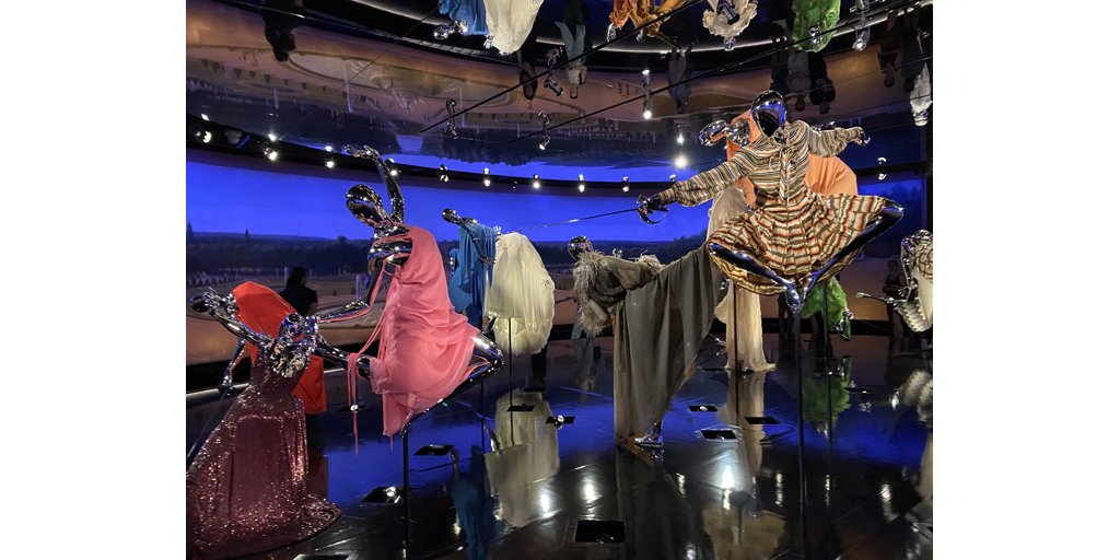
2022 Installation shot from In America: An Anthology of Fashion exhibition at the Metropolitan Museum of Art: “Battle of Versailles- 1973” Room, created by Tom Ford featuring contemporary designs by House of Dior, Bill Blass, Pierre Cardin, Anne Klein, Halston, Hubert de Gienchy, Emanuel Ungaro, Oscar de la Renta, Yves Saint Laurent, and Stephen Burrows.

The Metropolitan Museum’s Costume Institute seems to always find fresh, creative ways to engage and delight visitors! In America: An Anthology of Fashion, an exhibition addressing defining moments of fashion history through an exploration of men’s and women’s costume in the United States from the 18th century to the present is case in point. Embracing the theme of sartorial narrative in its fullest sense, Anthology makes brilliant use of the Met’s American Wing period rooms, which have been transformed into rich mis-en-scènes by nine different film directors - some more humorously, some more profoundly, but each layered with depth and meaning. Within these historic settings, costumed mannequins, imaginative story-telling, and cinematic acumen are cleverly deployed to activate time and space, weaving stories from the personal to the political, the aesthetic to the ideological.

Our favorite environment, and by far the most dynamic, was staged by Tom Ford, a renowned designer as well as a filmmaker. Ford literalized the so-called “Battle of Versailles,” a transatlantic fashion show (cum publicity stunt) that took place on November 28, 1973 at the Royal Opera de Versailles, which famously pitted French and American designers against one another. Quite unexpectedly the five underdog Americans – Bill Blass, Halston, Stephen Burrows, Anne Klein, and Oscar de la Renta –ran away with the show, captivating the ultra-chic audience with the modernity of their designs, the vitality of their choreography, and their American models "who “knew how to move in their clothes.” The sophisticated crowd went crazy, jumping up and down, and throwing their programs in their air like confetti! Marking a huge triumph for American ready-wear and a total upset for elegant European haute couture, the event re-establishing American designers as a force to be reckoned with. Of course the fashion “battle” involved a clash of feathers and fabric, fierce looks and runway walks, rather than fencing foils or martial art high kicks. But that doesn’t mean Tom Ford couldn’t re-envision/re-embody that mythic night - and some of the garments presented at Versailles - in these fabulously fantastical terms! Ohhhh, to have been there to witness the actual “guerre”!

Spotlight: The (Ancient) Writing on the Wall: Cy Twomby's "Making Past Present" Show at The Getty Center

Detail of color photomural of Cy Twombly in Rome, 1966, taken by Horst P. Horst, 1966. Shown along with Roman portrait busts from Twombly’s personal collection of antiquities, in The Getty Center’s installation of Cy Twombly: Making Past Present, August, 2022.

What’s old is new again. At least that’s an aesthetic mantra that American painter, sculptor, and photographer Cy Twombly (1928 -2011) seems to have lived by. Raised in Lexington, Virginia, Twombly lived in New York and studied at Black Mountain College in Asheville, North Carolina (among other places), before finding his way to Italy on a fellowship in 1952 with friend and fellow artist Robert Rauschenberg. Clearly, Twombly discovered something intangible but magic in the city of Rome that spoke to his soul. After a few more years of bouncing around from place to place, even serving as a cryptographer in the U.S. army, the artist would end up returning to Rome in 1957, marrying, and spending the rest of his life abroad with periodic trips back to the States. Twombly eventually grew his own collection of antiquities, displaying them among his own strikingly modern canvases and sculptures at his villa. The inclusion not only of the photo seen here , but of several of these actual classical sculptures from the artist’s personal collection within the Getty installation offers a wonderful gloss on this aspect of the artist’s life and oeuvre .

Throughout his career, Twombly was captivated by the intersection of the enduring legacy of the ancient and the contemporary in the Mediterranean world, seemingly wanting to explore and offer his own translation of this transhistorical experience. Time living in Gaeta in Southern Italy, in particular, seems to have given the artist closer contact with classical sources and fueled his engagement with cultural memory, especially through mythological subjects. He continually mined Greek and Roman texts (poetry, myths, even ancient graffiti) for themes, images, and 'words to deploy on his canvases. Venus became a major theme for him, as did the story of Leda and the Swan (iterated several times), along with the epic journeys and battles of Homer. Additionally, artifacts and ruins, sand, worn walls and ancient floors came to inspire the palimpsest-quality of his gestural, marked surfaces, as well as the creation of imaginative, often elegiac assemblage sculptures in abraded, muted whites. All of this sense of history and human experience comes together and truly “makes the past present” in a terrific show “Cy Twombly: Making Past Present,” co-curated by the MFA, Boston, that is now on through October 30, 2022 at The Getty in Los Angeles.

Spotlight: Mineo Mizuno at The Huntington: Bringing Together Diverse Artistic Traditions In The Most "Natural" Way

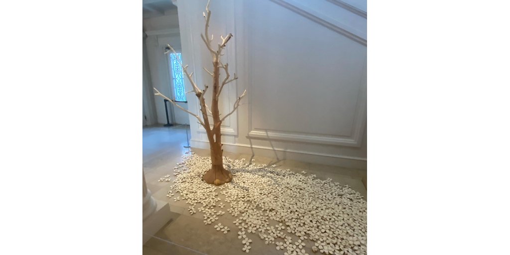
Mineo Mizuno, Komoreb i–light of forest. Installation materials: tree stump and ceramic pieces. The Huntington Library. Courtesy of The Huntington Library, Art Museum and Botanical Gardens, the artist Mineo Mizuno, and Gagosian Gallery.

Artist Mineo Mizuno’s temporary installation at The Huntington Library , Art Museum, and Botanical Gardens in San Marino, California brings together past and present in refreshing, unexpected ways! In one work pictured here, entitled Komorebi –light of forest, origami-inspired dogwood blossoms (hundreds of individual ceramic pieces) “scattered” around a real tree stump sourced from the foothills of the Sierra Nevada engage in whimsical conversation with a nearby 17th-century French terracotta sculpture of a tree nymph (originally made for the Tuileries Gardens in Paris), as well as the decorative Rococo-style of the Huntington mansion’s interior. As the wall label reads, Mizuno’s “artwork connects the ceramic traditions and aesthetic possibilities of his native Japan with the remarkable landscapes of California, where he has lived for over fifty years”. Fascinatingly resonant with the space and surrounding sculptural figures (and history of Arabella Huntington’s taste for Chinese ceramics and mixing of artistic traditions), the entire installation opens up wonderful new perspectives and associations, bringing a bit of the renowned gardens indoors, and taking The Huntington into the 21st century.

Spotlight: A First-Hand Look at "Garmenting"

Image credits: Garmenting exhibition at Museum of Art & Design, New York. Left: Saya Woolfalk, Mindfulness Activated Future Possibility Generator Storage System and Access Point, 2022. Center: Wall Didactic. Right: Kent Monkman, Miss Chief’s Tipi Dress (Red), 2020.

Garmenting: Costume as Contemporary Art, guest curated by Alexandra Schwartz, is a brilliant and visually stunning - at times surprising, often quite humorous - exhibition now on at the Museum of Art and Design in New York. We were lucky enough to attend a special walkthrough that Alix gave for colleagues last week, and to get a behind the scenes look, as it were.

A true passion project and intensively researched, the show took several years from inception to fruition, and we hope that many more curators will adopt “garmenting” as a useful lens on contemporary art.

Bringing together 35 artists from around the globe, some very well known and some lesser, the show probes the intersection of contemporary art and costume (since the 1980s on) and centers on explorations of how dress both expresses and shapes who we are - our personal, cultural and political identities. Not about fashion or fashion design, “garmenting” has to do instead with artists who engage with clothing as their medium - to create sculpture, installation, video, live performance, or some combination thereof. Garmenting opens with an installation, entitled Blue Days (1996) of simple blue dresses hung on a slightly menacing steel rack by the indomitable, multi-media artist Louise Bourgeois (who wore these blue dresses) and concludes with Esmaa Mohamoud’s powerful installation of Disney-like yellow and purple princess ball gowns, from her series One of the Boys (2017-2018), which are made of basket ball jersey material and have real Gator’s player names and numbers on their backs. Thoughtfully framed by the open-ended themes of Function, Cultural Difference, Performance, Activism, and Gender, and spread out across two floors, the works stand independently and in interesting conversations with one another, as well, of course, within the broader network of transnational garmenting histories ( some of which is discussed in the show’s terrific catalog).

Catch this fascinating and important exhibition before it closes on Sunday August 14.

Spotlight: Don't Miss the Boat: Crosscurrents is a Stirring Show of Winslow Homer's Work

On display in the Winslow Homer: Crosscurrents exhibition at the Metropolitan Museum of Art. Winslow Homer, The Turtle Pound, 1898. Watercolor and graphite on wove paper., 14 15/16” x 21 3/8”. Collection Brooklyn Museum, Brooklyn, New York.

Promise me you won’t miss the the Metropolitan Museum of Art’s stunning show “Winslow Homer: Crosscurrents,” which closes on July 31.

Featuring 88 works in oil and watercolor, “Crosscurrents” offers a fresh look at Homer’s oeuvre through the lens of conflict, reminding us of the complex times in with the artist lived and of his lifelong engagement with the charged subjects of race, geopolitics, and the environment. Interestingly, nature is always a protagonist to a certain degree.

You’ll find familiar post-Civil War scenes of soldiers, threshers, cotton-pickers, and school children, created by Homer as he grappled with embodying hopes for a renewed America after its unfathomable, violent divide. In addition, you’ll discover lots of moody sand dunes and seascapes, dramatic pitching boats, and New England folk walking the beach, struggling against the elements, or attempting dangerous rescues. But you will also encounter Homer’s remarkable, airy watercolors undertaken on trips to the coast of Florida, Cuba, and the Bahamas, and covering a range of subjects from local architecture to turtle fishing. The tropical palette, subtle details, and lighting effects the artist employed in this group left us breathless. It’s clear that these travels impacted Homer deeply, and that, whether in the States or abroad, he was a person who thrived when he near the water.

Spotlight: Let's Play Name That Painting

Does anyone remember that old tv show “Name That Tune” where contests would bet they could name whatever tune the band would play/the singer was about to sing in so-and-so many notes, and tried to outdo each other until they had boxed themselves into almost impossible feats of auditory recognition? I mean identifying a song in only 3 notes! It could be anything. I guess the contemporary version of this competition is “Shazam,” where contestants try to outdo other teams and then test their skills against an A.I. computer.

Well, what about art? Viewing how much of a particular painting is necessary to identify it? And what are the important give-aways or clues? Can you name the title of the painting above, for instance? or do you recognize the artist? If you guessed Nighthawks by Edward Hopper you would be absolutely correct. Part of the Art Institute of Chicago’s collection, this iconic urban scene was painted by the artist in 1942 and purchased shortly thereafter. Telegraphing a sense of modern alienation and preoccupation, the painting depicts four restless “nighthawks” gathered at late-night joint, disengaged from one another and lost in their own thoughts, illuminated by artificial lighting and surrounded by a deserted streetscape. Clearly Hopper knew his way around an American story and how to construct an evocative mood - whether at a lonely diner in New York City or at an empty gas station down some windy rural road. And, his tell-tale use of perspective and dramatic lighting are 100% cinematic.

Maybe the question is not so much recognizing this work by Hopper, as playing a game of what comes next in its narrative. What do think occurs after this scene the artist has offered us?

Spotlight: A Woman's Place Is At The Venice Biennale

“Vases, fillets, réceptacles, coquilles”: installation in the Arsenal exhibition space at the Venice Biennale 2022 including objects by 9 women artists representing 9 different countries. Image credit: photograph taken by Jean-Pierre Dalbéra on May 6, 2022, and published on FLICKR. Courtesy of Dalbéra.

Guest writer: Mia Reede

Coined as the Art World Olympics, the Venice Biennale was finally able to commence their 59th showcase of contemporary visual art this April. Occupying well over 7,000 square meters, including a main exhibition space, national pavilions, and other sites throughout Venice, it will remain open until November of 2022. Normally held in odd years and alternating biannually with the city’s prestigious architecture show, hence the name “Biennale,” the greatly-anticipated, tourism-driving event had been forced to postpone for an additional year as a result of the coronavirus pandemic.

This year’s Biennale exhibition, entitled The Milk of Dreams, was curated by Cecilia Alemani, an Italian-born curator working in New York. Its title derives from a book about a magic world by Surrealist writer and artist Leonora Carrington (1917-2011) and, according to Alemani, is meant to evoke the overarching theme of an imaginative lens/or lenses through which re-envisioning and transformation are possible and nods to the subtle thread between artists selected.

Despite the delay, artists remained eager to be featured at the esteemed international event, and this year’s show marks an especially unique milestone in terms of diversity. After sharing their list of artists in February 2022, it was confirmed that not only do the 213 artists represent 58 countries around the world, but also, with just 21 men participating, the majority of exhibiting artists are female or female- identifying. This lineup is a stark contrast to Venice Biennales in years past. As recently as 1995, 90% of the  Biennale’s artists were male; a percentage which is now reversed. 

Simone Leigh, a mid-career Chicago-based artist and sculptor was selected as the artist to represent the United States at the Venice Biennale this year. Her work, exploring themes of gender, race, and labor, has been increasingly visible in public collections over the last decade. The Biennale’s decision to select Leigh to represent the United states makes history as well as it is the first time an African American woman has received this honor. 

Centering the theme of African and African American women’s collective and individual work, which has traditionally gone unseen and unsung, Leigh’s powerful and moving exhibition “Sovereignty” employs transformed architecture, monumental sculpture, installation and video to compel visitor attention, bring the past and the present into conjunction, and raise critical questions around history, race, labor, and gender. 

If you have visited the 2022 Venice Biennale, or if you intend to, Boulevard Arts would love to hear what you think about its 59th iteration, and which installations you found/find the most interesting or moving. 

Spotlight: Don't Forget To Look Up When You Visit The Morgan Library & Museum

Photo: Rotunda Lunette (above the East Room of The Morgan Library) depicting the theme of Literature in the Ancient World painted by Harry Siddons Mowbray. c. 1905. Photo credit: taken by Larissa Bailiff.

Don’t forget to look up when you visit The Morgan Library & Museum, particularly when you step from the 21st-century Renzo Piano addition into the original McKim Building. Commissioned by American financier J. Pierpont Morgan (1837-1913), the original Library was erected on a plot just to the east of Morgan’s rather “modest” brownstone townhouse located then on the corner of 35th and Madison. The campus was finished in 1906, according to a set of exacting specifications and with the idea of sparing no expense. (Not saying that Morgan micro-managed the project, but you can read between the lines). Each of its rooms was conceived, constructed, and decorated to honor its patron’s sophisticated tastes and telegraph his appreciation for the continuum of Western history. The Library needed to be a gem box worthy not only of Morgan’s housing growing collection of rare books and artifacts, but also of his stature as a connoisseur/patron of the arts - an early-20th-century Medici, if you will.

The West Room, which served as J.P. Morgan’s private study and “uptown” office (when he wanted to be away from Wall Street) is dominated by shades of red - from its scarlet upholstered furniture and carpet, to walls covered in a Scalamandre brocade of a similar blood-red. The room’s “re-purposed” ornately-carved dark wood ceiling once belonged to an Italian Renaissance building, and McKim actually based the room around it, ostensibly Morgan’s idea.

The grandest space, the East Room, with its three stories of inlaid walnut bookshelves, served as the library proper in Morgan’s day. It now also houses a few sculpture and vitrines displaying rare books, writings, musical scores, letters, and other precious objects. Here, the ceiling comprises an intricate late-19th-century paned-glass design, while the painted architectural elements just below it take their inspiration from Pinturicchio's sibyls in the Church of Santa Maria del Popolo in Rome. Allegorical depictions of the arts and sciences alternate with portrait roundels of great men of history - from Socrates to Galileo - imagery underlining the room’s dedication to learning and achievement. In the hexagonal spandrels above these figures, are the signs of the zodiac, culled by Mowbray from the decorative program of the Villa Farnesina. Alluding to important moments in Morgan’s own life, these astrological figures are arranged symbolically rather than chronologically.

While the Rotunda has an ornately patterned floor, mosaic-paneled walls, and colorful marble columns, it is the ceiling, the apse, and the lunettes that turn this space into a seeming “temple of the arts,” announcing it as a repository of civilization and culture. When Morgan was alive, select guests who were invited to his Library for social or professional occasions would walk up the steps to the building’s compact portico, be let in through the enormous bronze doors, and received within the foyer of the Rotunda.

Much like an ancient church or temple, the room opens up vertically into a light-filled space topped by a central domed ceiling with an oculus. This high ceiling is ornately decorated with Renaissance-inspired figures and scenes surrounded by colorful and gold accents - Greek key designs, acanthus leaves, scrollwork, etc. which highlight its architectural elements and reference the past . We also see nod to the four branches of learning through identified allegorical figures representing religion, philosophy, science, and art . On one side, an apse-like space is decorated with blue and white stucco reliefs of classical and mythological subjects inspired by Raphael’s design for the Villa Madama. Below this, is a Della Robbia ceramic of the Virgin and Child with a Latin inscription:“Glory and honor to God alone” - unifying the schemas of Classicism and Christianity.

Perhaps even more spectacular are the three huge lunettes on the remaining walls, which pay homage to Pinturicchio’s 16th-century murals. Each highly-detailed painting by Harry Siddons Mowbray (1858 – 1928), who also painted the Rotunda ceiling, represents a specific literary era. The tri-part program was intended to celebrate the theme of writing throughout history, a major thread running through Morgan’s collection. Above the West Room, the lunette dedicated to lyric and amorous poetry from the Renaissance Period includes representations of Tasso and Petrarch surrounded by figures from their work, included Petrarch’s beloved Laura. Opposite the apse, above the building’s entryway, is a lunette dedicated to the chivalric romances of the Middle Ages; the eternal flame appears in the center flanked by Dante, Virgil and Beatrice and several Arthurian characters including Guinevere and Lancelot. And, finally(seen in the spotlight image above), the lunette over the entryway to the East Room depicts Epic Poetry flanked by Orpheus and Homer, along with figures from The Iliad and The Odyssey. Interestingly, the blind Homer, whose poetry was reportedly passed down through the oral tradition, appears holding a clay tablet and stylus. The inaccurate inclusion of these implements clearly demonstrates the desire to chronicle the writing/reading “technology” of each period. In the depiction of the Middle Ages, we see a scroll manuscript; in the Renaissance painting, Mowbray includes a book. Also, if you look closely, you will see that all the gilded details are actually built-up and three-dimensional ; the painter even added a few trompe l'oeil , or eye-fooling, features into the ceiling and lunettes, so be sure and spend some time with them.

Point of all this is is to say - that while you are busy at The Morgan Library exploring all the fascinating historic objects - the cylinder seals, clay tablets, manuscripts, letters, and rare books - in the cabinets and vitrines, as well as the tapestry and paintings on the walls , don’t neglect to look up or you will miss some of what makes this such an incredibly special place to visit; you’ll miss some of the stories Mr. Morgan wanted to share with posterity.

Spotlight: Veggies as Ultimate Status Symbol: Arcimboldo's Famous Portrait of Rudolph II

Giuseppe Arcimboldo, Vertumnus (Portrait of Holy Roman Emperor Rudolph II, 1591. Oil on panel. 27.55 in x 22.83 in. Collection: Skokloster Castle, Håbo Municipality, Sweden. Wikimedia Commons.

Trying to figure out what to do with your extra CSA vegetables and fruits? Maybe you should take a page out of Guiseppe Arcimboldo’s book! Though he worked in many genres, the imaginative Late Renaissance artist (who lived from 1526/ or 1527 to 1593) is best known for painting busts (head-on or in profile) that served as delightful “capricci” meaning jokes or games. One famous example is this audacious and amusing portrait of Arcimboldo’s most important patron the Holy Roman Emperor Rudolph II. Created in 1591, it describes the Hapsburg ruler entirely through a copious bounty of seasonal and exotic fruits, vegetables, flowers, and grains.

Look closely. How many elements can you identify? Note some of the visual puns - including the “peachy” cheeks and “ears” of corn (a foodstuff only available in the New World at this time!) Having commissioned this portrait (along with many other more traditional ones), Rudolph shows himself to possess sophisticated taste and “in” on the painterly joke. In addition to being clever, Arcimboldo’s painting coincides with a growing interest in the natural sciences, especially in botany, as well as a growing desire among the European elite to showcase their knowledge about and collections of species, objects, and oddities from far off places. The fact that Rudolph had access to myriad items from different seasons and particularly luxury produce from foreign lands was intended to demonstrate his extensive dominion, status and wealth. Additionally, the painting’s title “Vertumnus” associates Rudolph II with the Roman god of changing seasons, who was said to have been present at the birth of Rome, linking him not only with divine abundance but the history of the Roman Empire. Not too shabby for a guy depicted in pomegranates, figs, gourds and cabbage.

Spotlight: So Many Great Women So Few Great AR Experiences About Them

Jabobus Houbraken, Maria Sibylla Merian portrait in color, c. 1700, color engraving (Courtesy of Wikimedia Commons, CC 1.0) from the Maria Sibylla Merian experience in BLVRD Sketches app and Unknown English Artist, Queen Elizabeth I (Coronation Portrait), c. 1600. (Courtesy of the National Portrait Gallery, London) from the Elizabeth I experience in the BLVRD Features app.

If one augmented reality experience is good, then two is even better, right? You know how Boulevard Arts recently released its latest BLVRD Features #AR episode about Queen Elizabeth I.  Well, now we have another surprise in store for you, a brand new free app called BLVRD Sketches, which includes several art & culture installments previously available in the BLVRD Features app, along with an exciting new experience about another remarkable woman from the past, 18th-century scientist and illustrator Maria Sibylla Merian.

 The new “Maria Sibylla Merian” episode provides an opportunity to explore the themes of history, art, and science through the story of a bad-ass trailblazing ecologist and entomologist whom you might - or might not - have studied in school, and who preceded experts like Charles Darwin and James Audobon by decades.

 Users can bring one of Merian’s stunning prints of insects into their own space and examine it closely. Then they can open the print up to reveal several exciting related images, including an 17th-century global map, a contemporary early microscope, and also some of Merian’s scientifically accurate depictions of varied and exotic species from Surinam, like the Caiman Lizard and False Coral Snake. You don’t get to see those animals everyday!  

 Download the BLVRD Sketches app and learn more about Merian today! Or are you scared of a lizard?

Spotlight: Faith Ringgold An American Bard

Faith Ringgold, Woman on a Bridge #1 of 5: Tar Beach, 1988. Acrylic paint, canvas, printed fabric, ink, and thread, 74 5/8” x 68 1/2”. Collection: Guggenheim Foundation, New York.

Maybe you recognize this narrative quilt by Faith Ringgold or are at least intrigued by its story-book character. It is actually part of a series that was turned into Tar Beach (1991) Ringgold’s semi-autobiographical illustrated children’s book exploring the wonderfully resilient and imaginative world of a young, girl named Cassie Louise Lightfoot growing up in Harlem during the 1930s. In this magical scene, Cassie is not only pictured on a blanket staring up at the sky from the tar-covered rooftop of her family’s apartment building but also a second time soaring high above the string of lights illuminating the George Washington Bridge in the background, evoking an empowering sense of freedom and limitless . The jazzy, colorful quilt, along with related sketches for Tar Beach, are are currently on display at the New Museum in New York in a terrific, comprehensive show entitled Faith Ringgold: American People, up until June 5.

Whether or not you are familiar with Ringgold’s “story quilts” (fascinating sewn and painted textiles bordered with or incorporating handwritten text) this installation will be a revelation, and serves to give the 91-year old New-York raised artist, educator, and activist more of the due she truly deserves. Since the end of the 1950s, Ringgold has been practicing (teaching, and protesting) at the intersection of contemporary art and human rights. Her multi-media oeuvre has raised provoking questions around the themes of art vs. craft, history-telling, and identity politics, frequently centering the social and economic inequity of women and African Americans, which the artist has explored in various styles and materials, as well as through performance and collaboration. While the figurative quilts, for which Ringgold is best known, are especially compelling - delightful, detail-filled, art-historically referential, humorous, at times jarring - (portraying fictionalized as well as historical figures from Josephine Baker and Pablo Picasso to Frederick Douglas and Harriet Tubman), Ringgold’s production is far more broad, complex, and experimental as evidenced in the show. In addition to dozens of individual and serial quilts, works on display include a slew of powerful, menacing oil paintings about segregation and racism in America/New York during the mid 1960s, Kuba-cloth inspired graphic protest posters and paintings, thankgas and other ritualistic hangings, and large-scale dolls and costumes for performances.

You will certainly leave “Faith Ringgold: American People” with a better understanding of this important artist, and you will likely gain insight into aspects of American society over the last six decades as well. If you want to get further context into the artist’s life, struggles, and accomplishments, pick up her memoir: We Flew Over the Bridge (1995, republished in 2005).